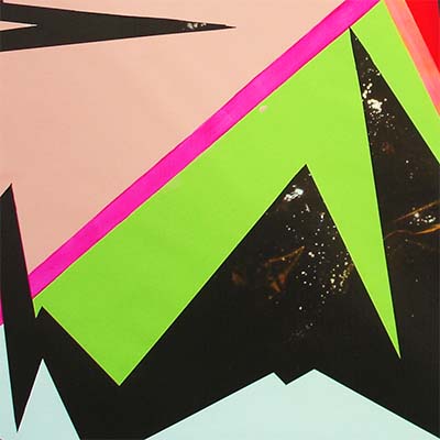
Trailblazer
October 28 - November 22, 2014

Miranda Parkes' new show is called Trailblazer. So what new trails might she be blazing here? To answer this, we must first characterise her previous work. Very generally, this has been based around areas of bold colour with edges masked and poured, and compositions organised loosely about the grid. Most often this whole has been physically crumpled, billowed and compressed onto a stretcher much smaller than the canvas might have expected. Very distinctive - these are the "scrunchie" paintings, so-called.
Now back to this exhibition's title work. First and foremost, it's big and flat. It is worked over the top of a (rejected) photomural by Ed Lust, chosen by Miranda for its deep, dark sense of galactic space (an illusion of depth just too compelling to be ignored by any painter worthy of the name.) Parkes has worked on bigger scale before - Whopper at Tauranga Art Gallery in May-June 2014 being a splendid example. But here she uses Lust's black space (masked) as a jagged frame, a visual foundation for her painting which is then shot through with diagonal vectors of fluoro pink and orange, and anchored a little by fields of slightly less intense hue. No organising grid here, but an all-over zest for life; an exuberance that a little like Gavin Chilcott in the mid-80's, is wonderfully difficult to ignore.
Chorus Valley is also painted on a surface second hand. A little landscape, a most unusual subject for this artist, is given the Parkes treatment. The sky remains original, I'm told, and she has honoured the composition of tree with mid-ground hills behind. But a slash of heavily extruded paint, reflective surfaces and loud stripes turn up the volume in this little painting (hence its title, I guess) in dastardly but endearing ways.
We have seen similar feats of painterly engineering (exhibited in the utterly laden but tiny
Piggybacker) before, and also the light painterly structure given the wall upon which it is hung. But have we seen the playful, carefree genesis of a painting like
The sun, the moon and the ugly? Parkes starts with her palette, and paints concentric circles around the dropped blobs thereupon. Parkes has always been inventive and intuitive around the start-up, the ignition of a painting. And the fluorescent glow to the back of the silver frame of this painting, the final act of this painting, is also novel.
There is in Nightlight too, research and resolution that is both compelling and probably new. The grid begins it. But there is a hot triangle of red orange that looms large out of a sea of silver, right beside a glutinous pile of oil paint in the centre that together reduce the grid to mere texture beneath. In other words, there are details of overlay and form in this painting that look seriously daring and full of pretence. It is a small painting that feels big. It points I think, to trails along which Parkes might well blaze into the future.
JS
List of works:
Trailblazer (with thanks to Ed Lust)
acrylic on digital print 2200 x 4000mm
The sun, the moon and the ugly
oil and acrylic on paper 425 x 380mm framed
Chorus valley
oil and acrylic on found painting 370 x 440 framed
Piggybacker
acrylic on timber frame 100 x 100 x 65mm
Sugarcoater
acrylic on wall dimensions variable
Gold digger
oil and acrylic on canvas 250 x 250mm
Nightlight
oil and acrylic on canvas 440 x 440mm
All works are from 2014


